By Peter Ramsey
24 Jan 23
The hidden complexity of bank cards
Historically, bank cards were relatively simple rectangles of plastic.
You typically only had one. If you wanted to segregate money into your savings, you'd need to open a specific savings account—and that had its own card.
Undoubtedly accelerated by both the app-first banks, and the mainstream use of Apple/Google Pay, this space is maturing quickly.
There are now physical, virtual and temporary cards (of which you can have many), Apple and Google Pay, virtual savings pots, cross-currency accounts and more.
This chapter is all about those colourful cards, and how the accumulation of that feature complexity has been tackled in 2023.
And as a hint, it involves a lot of copying.
- Something that's been heavily copied since 2020
- Something that should be copied
- The difficulty of copying the challengers
- Knowing when to remove something you copied
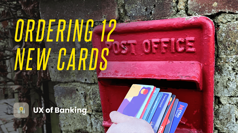
But first, let's order 12 new cards.
12 case studies:
💡Tip: Click on the logos below to swap between the case studies.


Key takeaways:
1. Card management
Nowhere is the growing complexity of the card ecosystem more obvious, than when looking at the broad range of app designs.
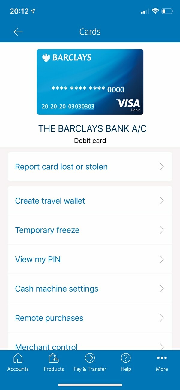
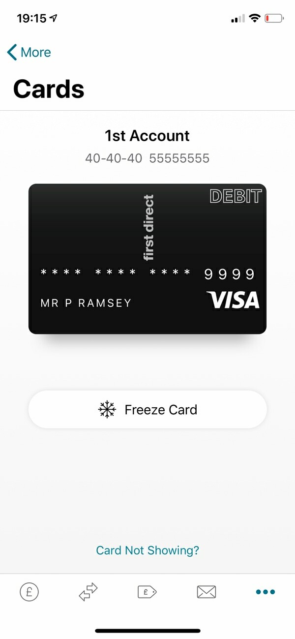
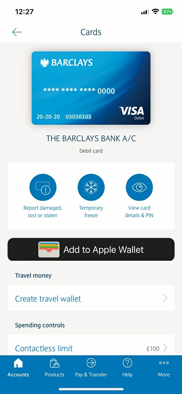
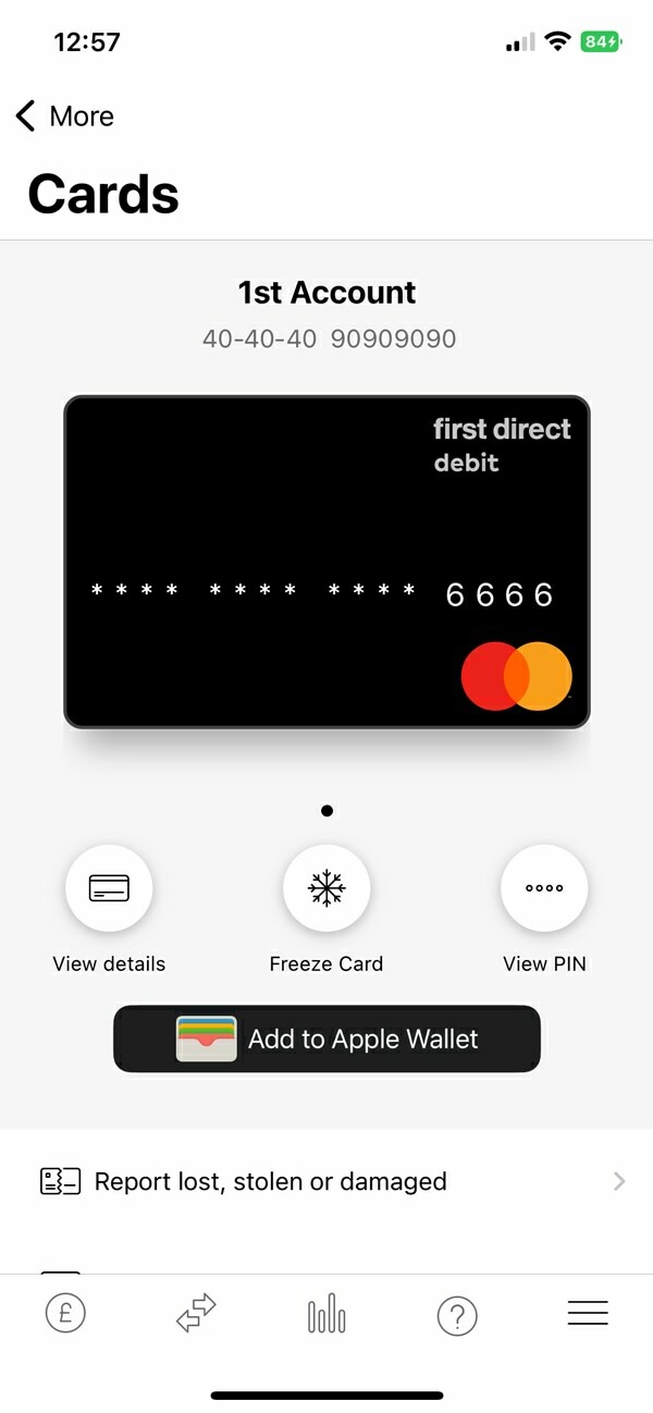
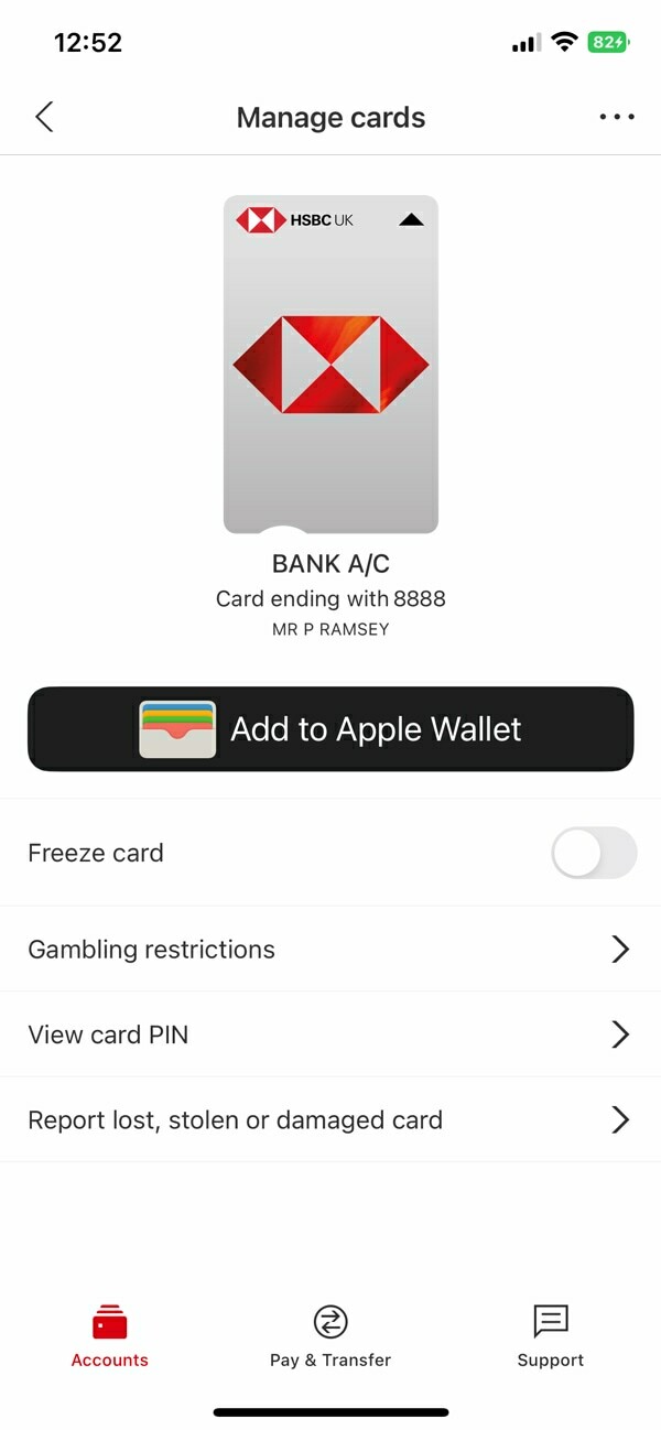
In 2020, I was critical of how most of the incumbent banks handled these features. They lacked context, the designs themselves were really poor, and there were basic usability issues.
New features, like freezing your card, or showing your PIN inside the app, were simply added as new rows—similar to a settings page.
This was the predictable risk of adding new functionality into your app (over a decade), without rebalancing the core user experience.
Barclays (2020)
First Direct (2020)
HSBC (2020)
Unburdened by how things were, Monzo, Starling and Revolut seized the opportunity to design something that felt intuitive for this new paradigm.
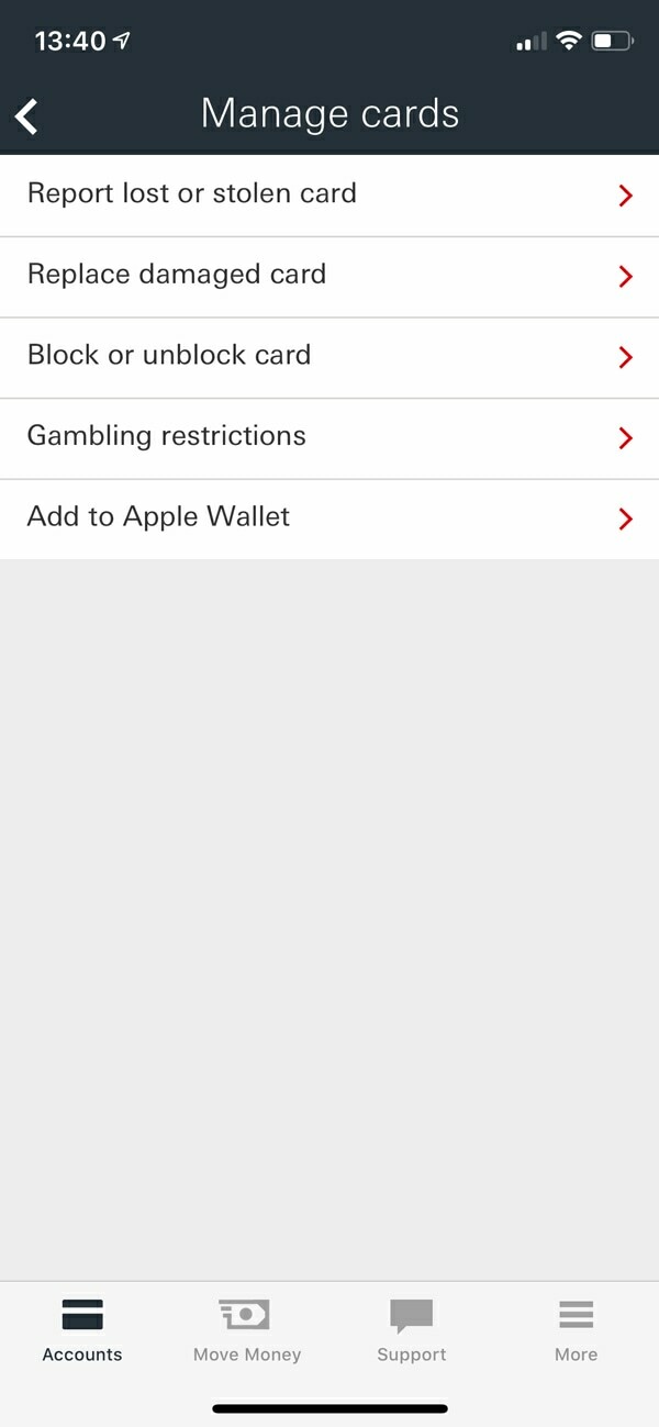
Since 2020, there's been a noticeable effort to replicate what works, and the experiences are looking very similar.
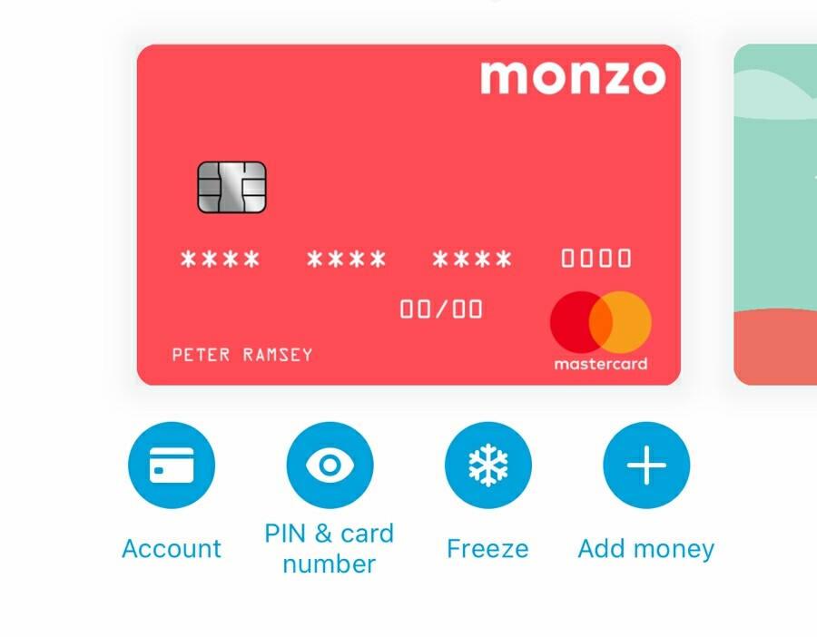
In particular, the order and positioning of the most common card management features—as shown above on Monzo in 2020.
Barclays (2023)
First Direct (2023)
HSBC (2023)
This is true both of the visual aspect of design (i.e., how it looks), and the functional architecture of managing your card (i.e., how it works).
I can demonstrate this quantifiably too: the variance between the number of clicks that it takes to freeze your card, is shrinking.
Aside from a few nuances and wasted clicks here and there, the banks are somewhat reaching parity.
Clicks to freeze card


Clicks
2. Chasing clicks
But here's the problem with copying a successful design: do you actually understand why it's worked? Have you lost the magic somewhere in the replication? Can you then innovate your own ideas onto them?
Most of the attempts to replicate the UX of leading products, like Stripe or Airbnb, fail to notice the nuances that make them so effective.
The 12 case studies above show a broad range of UX quality: some great, some terrible.
It's a scenario where misunderstanding the psychology can be misleading, and blindly copying others will incubate bad decisions.
Here's a breakdown of the number of clicks it takes to order a new card:
Number of clicks to order a new card

Clicks
In this instance, the number of clicks is the wrong metric to care about.
There appears to be very little positive correlation between the better experiences (e.g., Revolut, Monzo, Starling, Natwest and Nationwide) and the number of clicks.
In fact, having too few clicks is more likely to be an indication that there's not enough context (or that it's crammed into one screen).
Let's consider a few nuances to this specific user journey:
📅
1. Infrequent usage
Most people aren't ordering new cards every month. So this isn't a 'power feature'.
😰
2. Negative connotations
Most of the time you're ordering a new card due to a negative event (e.g., stolen, lost or damaged).
⌛️
3. Time sensitive
People need a new card quickly. The context behind delivery speed is important.
Those who've lost their card will likely be looking for reassurance and comfort, rather than efficiency—which I call 🍟 Context Craving.
Metro has so few clicks, because it's essentially one screen, with two buttons. You have no option to keep the same PIN (say, if you've damaged your card at home), which means that you have to wait for both a card, and a PIN to arrive.
The 2 clicks saved by not asking this preference, forced me to wait an additional 2 days before I could use my card.
Time to have an active card
Working days
And they're the two metrics I'd measure success by for this user journey:
- How good was the experience (qualitative)
- How quickly can they use their card (quantitative)
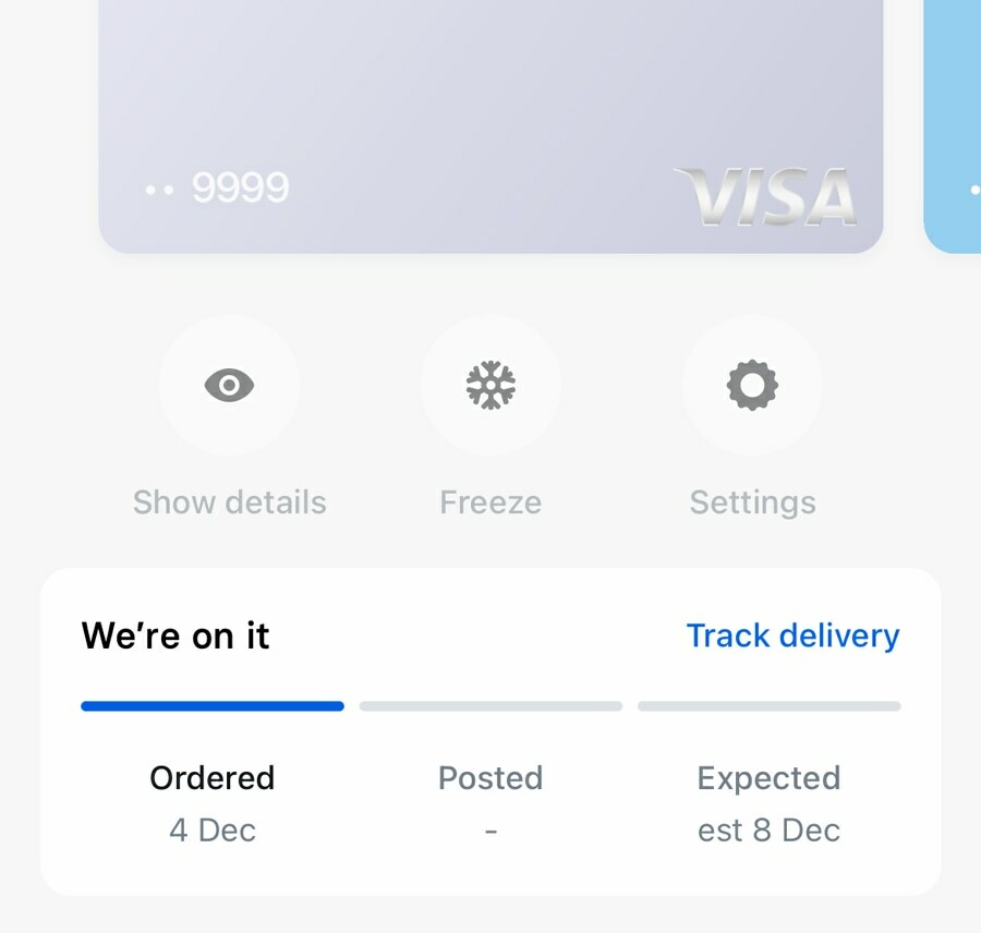
And in addition to nailing the delivery, Revolut have been innovating the experience, without regard for clicks.
If Monzo's card management was the design to copy in 2020, then Revolut's delivery tracker should be 2023's hot property.
I'll often refer to clicks throughout this publication, but this raises an important nuance: it's only sometimes relevant—I'll make it obvious when it is.
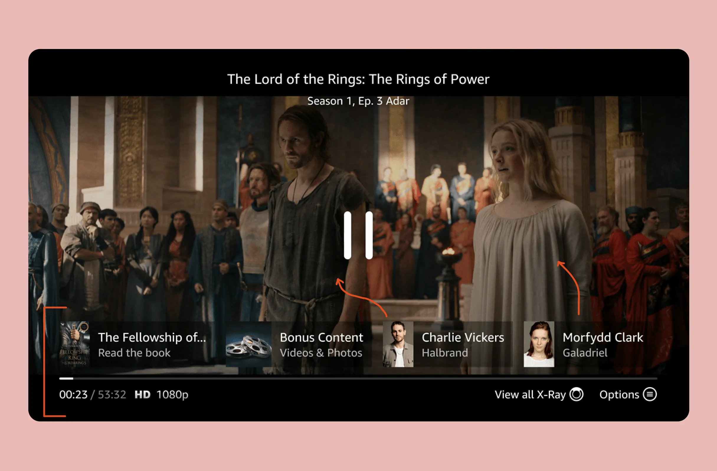
3. On it's way
Let's take a moment to look at the post-order experience in more detail.
For the few days between ordering a replacement card, and receiving it, Monzo, Revolut and Starling show prompts on the homepage dashboard.
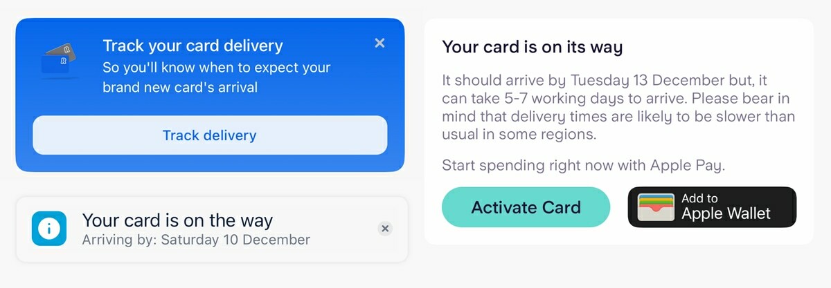
Lloyds and Natwest sort of do this, but they're temporary full-screen prompts that appear once when you log in, but then aren't visible as a component inside the dashboard.
Yes 🎉
Sort of 👍
No ❌
Monzo
Lloyds
Barclays
Revolut
Natwest
Co-op Bank
Starling
First Direct
HSBC
Metro
Nationwide
Santander
The obvious benefit of these dynamic components is that they remind the user of when their card is expected to arrive.
And the subtle distinction is that they give you a specific date, which is instantly digestible.
Despite showing prompts, neither Lloyds nor Natwest actually print the expected delivery date like this—which is a shame, because it's the secret sauce.
Giving the actual day is a reference that doesn't require memorising when you ordered the card, or the unintuitive calculation of what a working day is (i.e., do they include Saturday? Is next Monday a bank holiday?)
This kind of data simplification is true in almost all aspects of life:
Digestible ✅
Require processing 🧠
Tickets are available on Tuesday 15th March, at 9.00am.
Tickets are available in 67 days and 12 hours.
Your blood sugar is 140 mg/dL, which is normal.
Your blood sugar is 140 mg/dL.
I'm available this afternoon (11th Jan) for a chat.
I'm available in the afternoon of the 11th January for a chat.
To emphasise how messy reality can be, the 'estimated delivery dates' given were often inconsistent, and certainly unintuitive.
For example;
- HSBC advises 4-10 working days on the app, but then when I had to phone them, they told me 5-7.
- Co-op Bank, estimates 3-5 working days for the card, but then 6-9 working days for the PIN.
Contextualising data is important, always.
4. A grandfathered decision
Finally, you may have noticed that Barclays, First Direct and HSBC ask you a series of questions about where and when (to the minute) you lost your card.
The others don't, and so I doubt that this is a legal requirement. Rather, I predict that this is either a grandfathered decision, or the battle scar of an argument won by a compliance team.
Barclays, for example, ask the following:
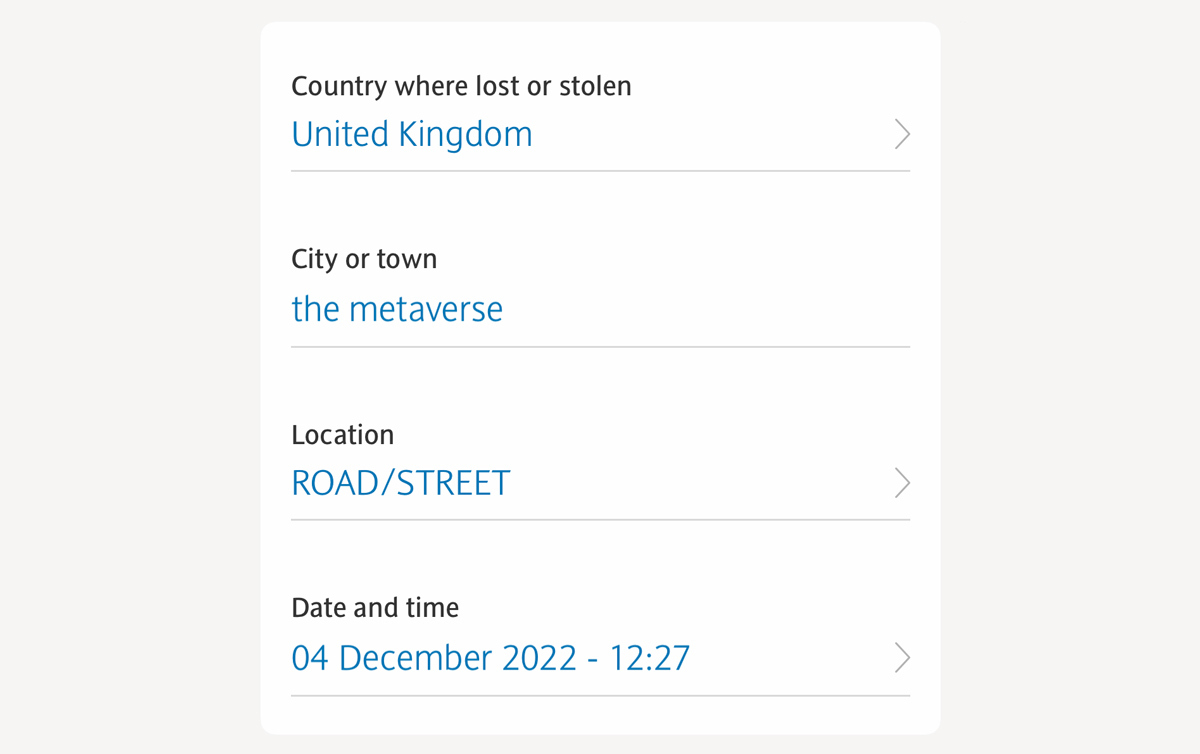
You would not believe how often I hear product teams assume that collecting data is beneficial, despite neither using it, nor having a plan to.
"Data is the new oil" has become a lazy justification for asking questions, despite already drowning in surplus untapped data.
These questions may seem harmless at first, but I'm confident that they're creating a surprising amount of unwanted (and probably un-tracked) friction.
🤯
1. Unwanted friction
These questions can't be answered with a simple 'yes' or 'no'. They require recalling information, and some introspective detective work.
📈
2. Untracked
People will still order their card, and so there's no obvious drop-off rate to monitor.
Partially, this will have a high 🧠 Cognitive Load because there's no satisfactory way of declaring that you don't know. Instead you feel compelled to give a specific minute that you lost your card.
And then there's the knock-on effect of how intrusive it is. Why are they collecting this data? Is this used against me?
And the unfortunate truth is this: once added in, steps like this are hard to remove—they become debt.
The skill of being able to identify and remove dead wood, is one required by both forest rangers, and product managers.